Hershey Pot of Gold - Design Strategy & Packaging Design
Challenge
Evolve a dated Christmas classic into a contemporary gift of choice that both retains core 55+ consumers and attracts younger millennial audience.
Solution
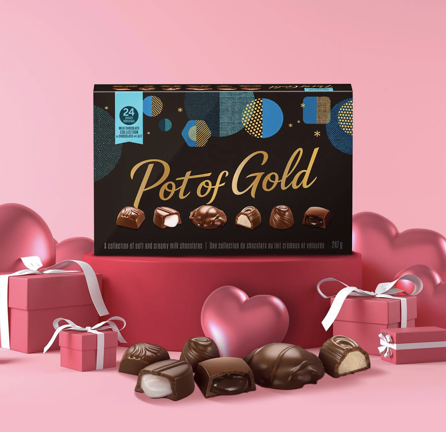
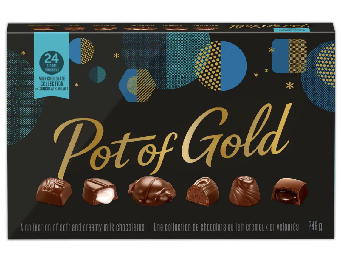
Global category analysis identified the opportunity to differentiate from conventional category codes of gold and red by creating a proprietary pattern design system injected with vibrant jewel tones and design cues evoking gifting a “token of delight”. The new pattern design system makes the packaging feel like part of the gift, yet is versatile enough to live on shelf all year - suitable for all gifting occasions. Enhanced photography heroes chocolate assortment to increase flavour and taste appeal. A custom colour palette was created to amplify each assortment and aid easy shelf navigation. An updated wordmark was created to add a contemporary feel while still maintaining the brand’s core equity.
Result
Increated national distribution and exceeding sales target for peak holiday season.